Cookies 2.0
After most of Cookies’ competitors followed their revolutionary approach to branding and packaging, Berner had the genius idea of changing the game again.
We led a complete revamp their portfolio to compete more aggressively in a increasingly competitive California market. We took learnings from the brand’s explosive international growth over the previous 4 years and channelled it into the Cookies 2.0 initiative. It was a return to their roots. A hero returning home with wisdom and the conviction for what matters most: flavor, quality, innovation
Challenge
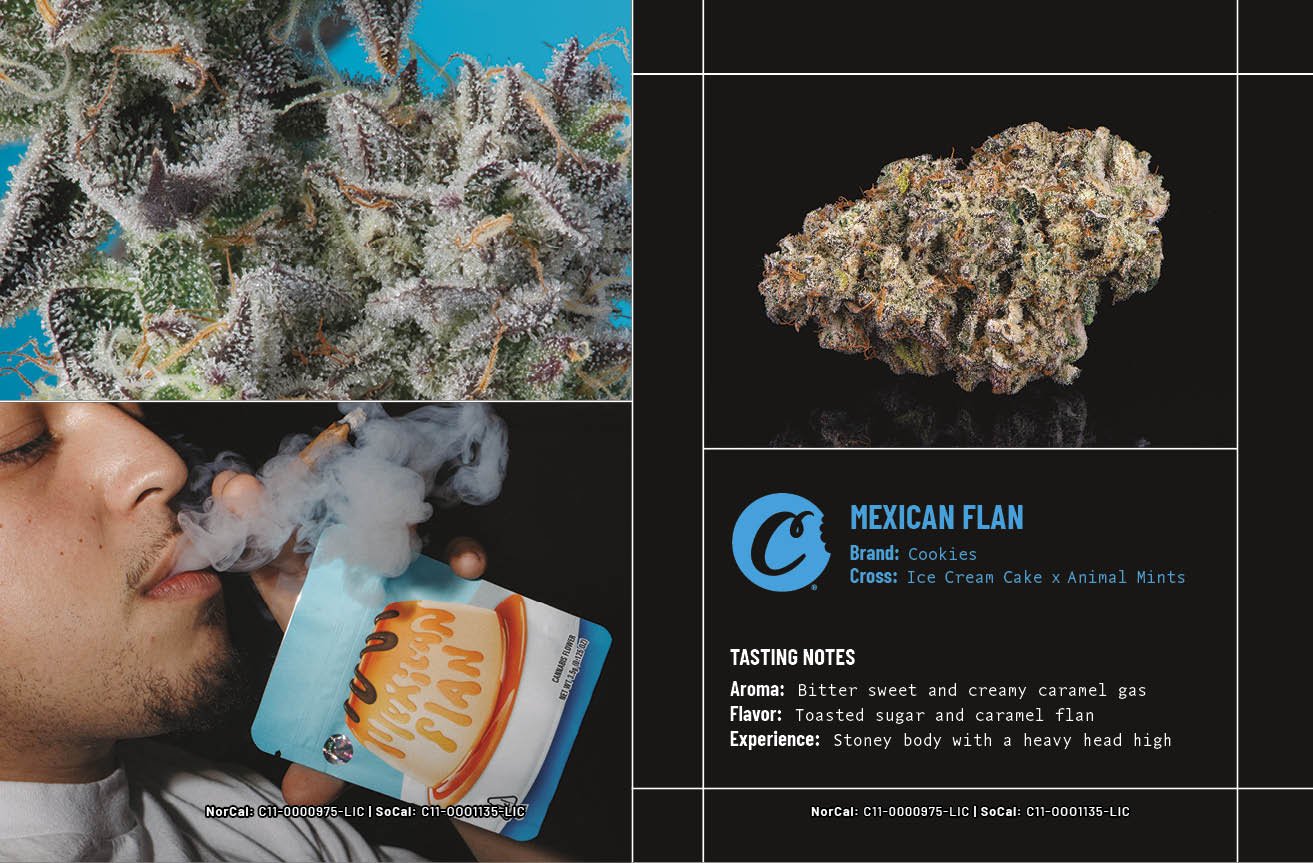
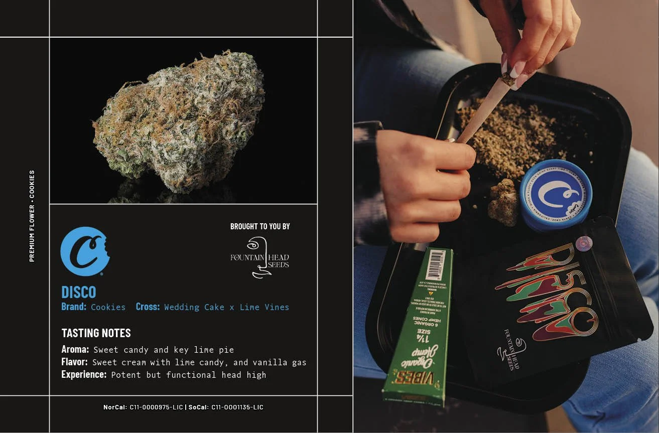
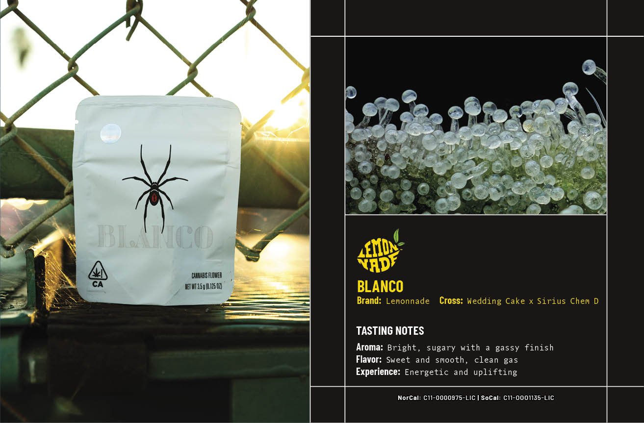
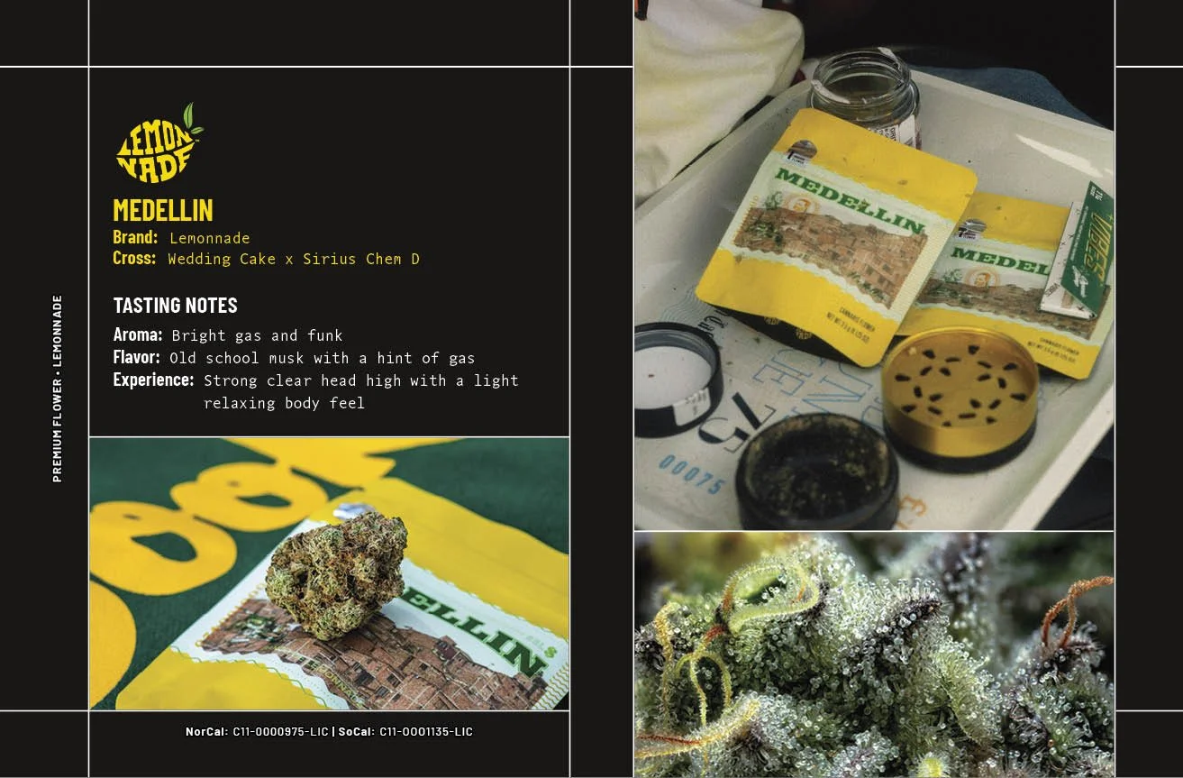
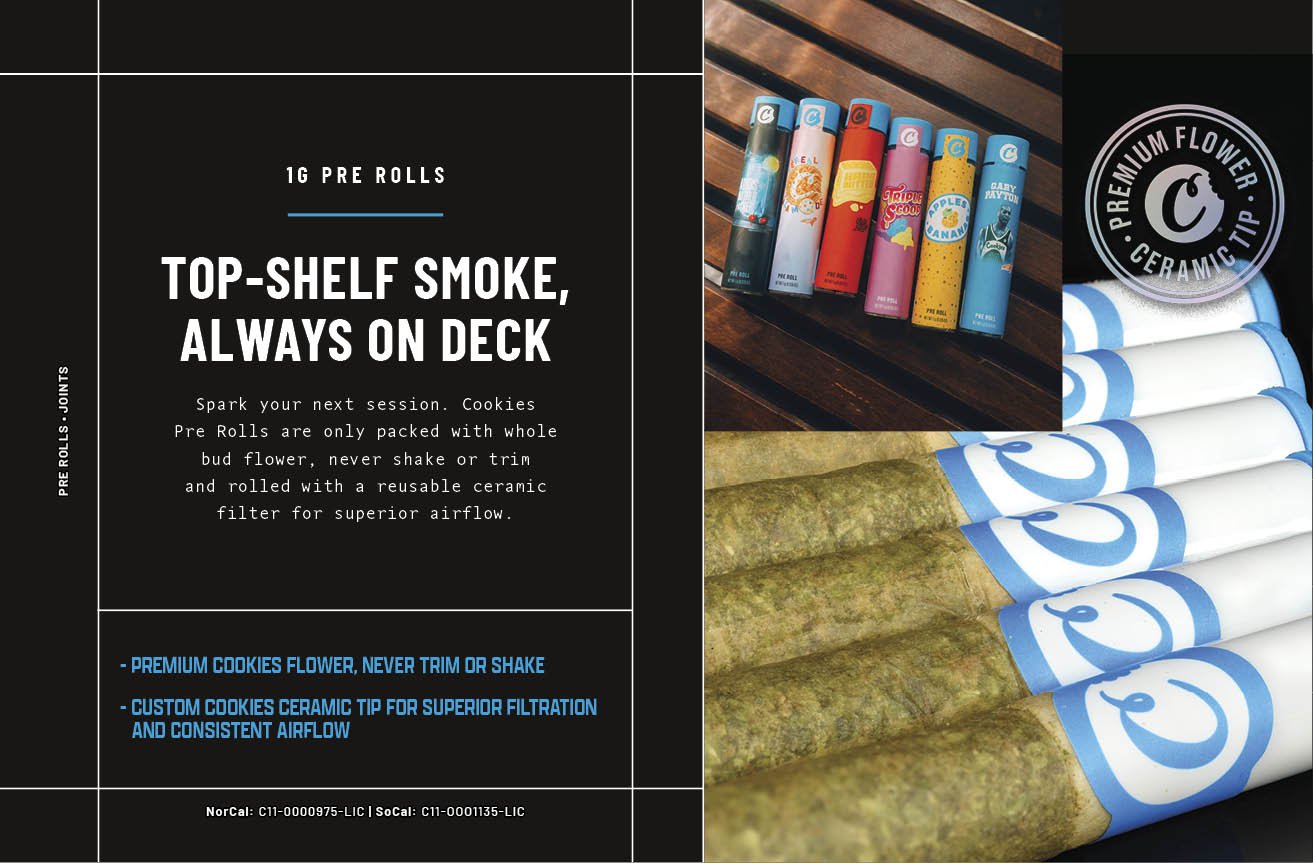
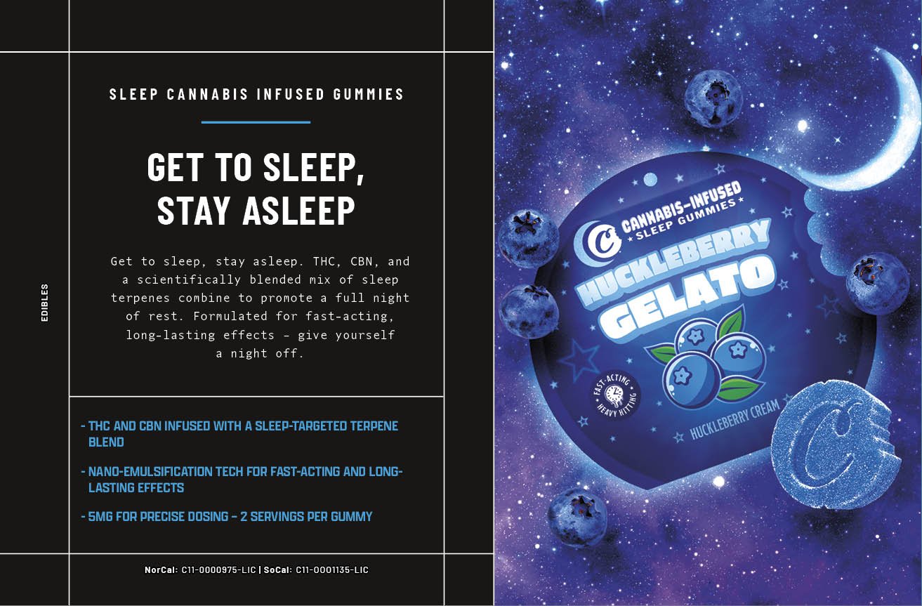
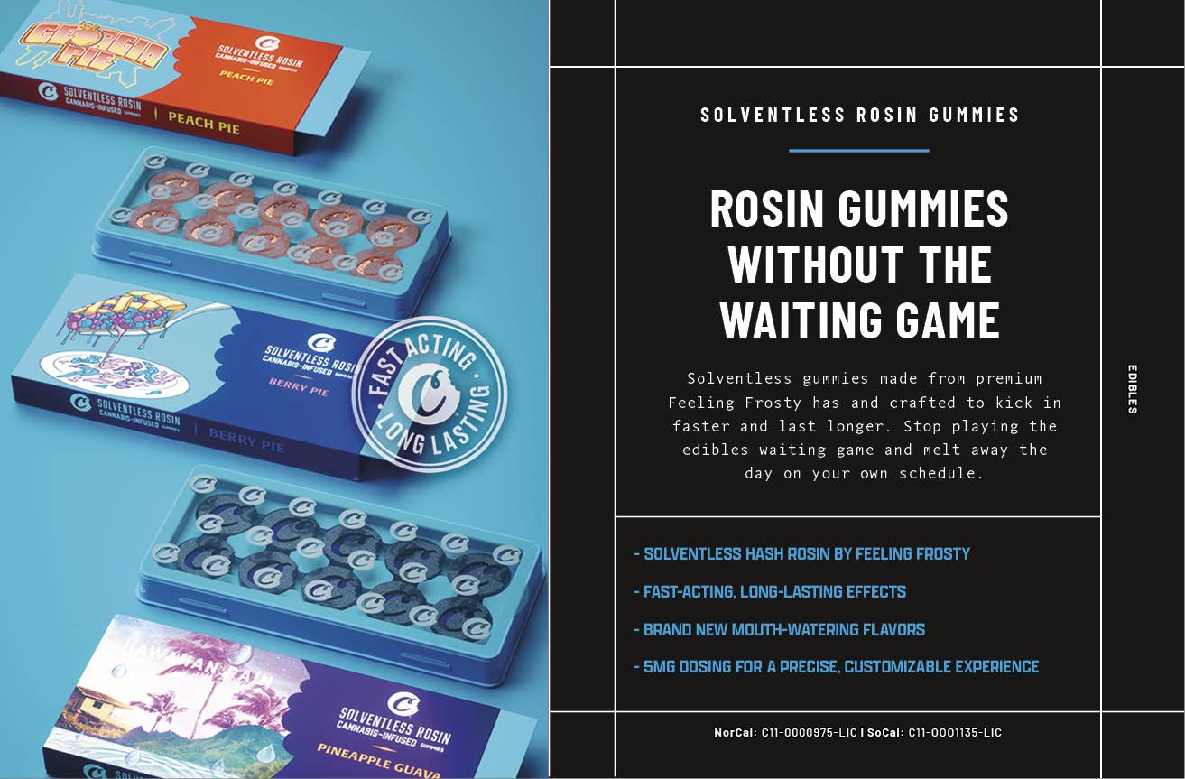
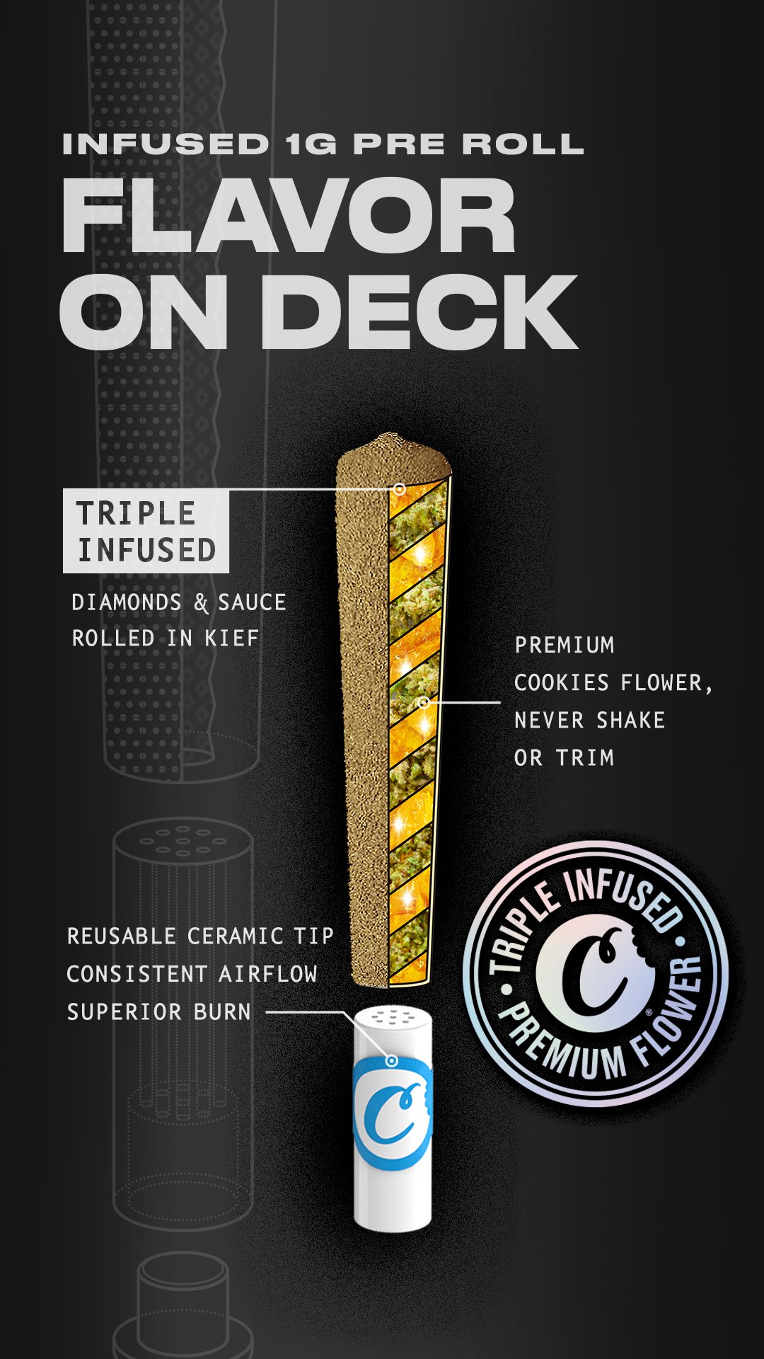
Cookies needed to tell an innovation story, show the full lineup in each category, as well as an individual marketing asset per sku. We developed 3 design assets that could be adapted and extended as needed:
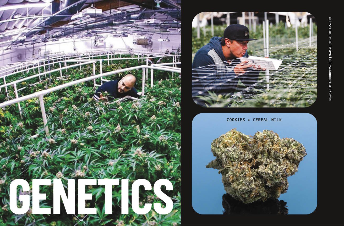
Hero Image: a single image that told the entire story. The image and copy could be used in it’s entirety or stripped down for simplified assets.
Family shot: Show the entire flavor lineup for each product category
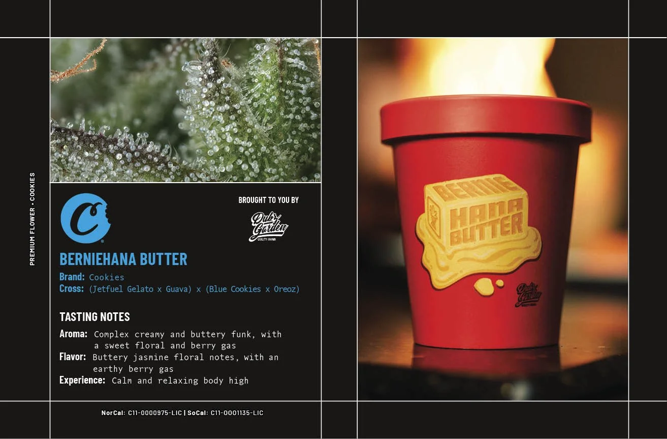
Flavor specific: A simple sku specific asset
Rollout
While leading the redesign of the packaging and marketing direction we worked closely with the product and brand team to ensure we were sending a message to all core and new customers that this was a new day for the brand. Reclaiming Cookies’ place as the original innovator in the cannabis space.
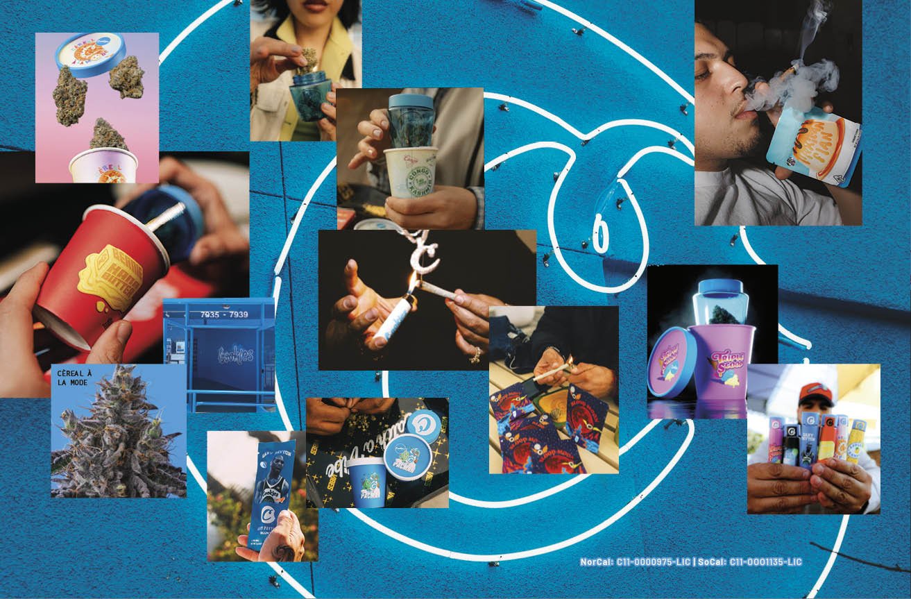
This look and feel was extended to a number of applications: web, social, email, paid media, in store, sales catalog and more…
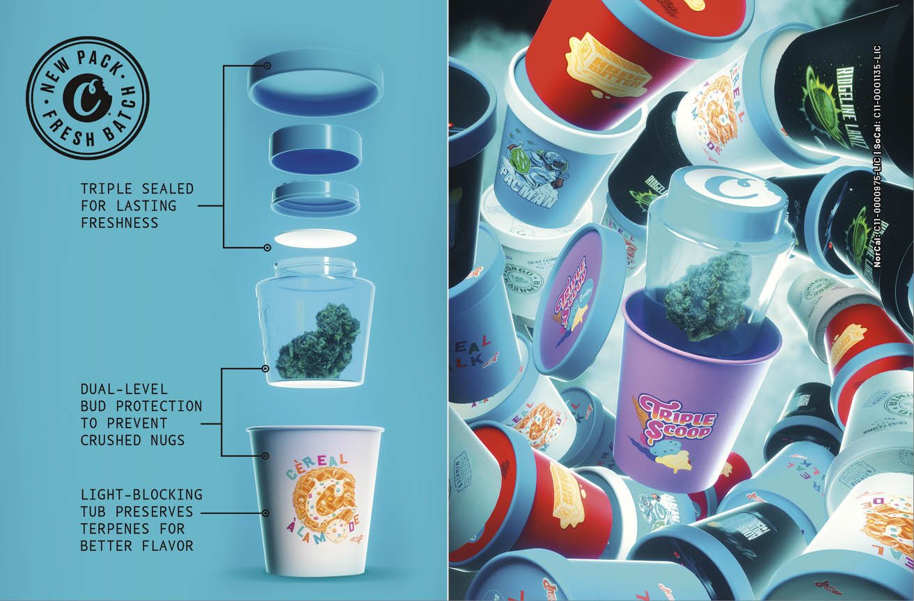
New Flower Tub Packaging For Weed
Infused Pre Rolls
Vapes with
Gravity Fed Tech
Gummies
New Product Catalog


